Are you looking to create visually appealing ad designs that capture the attention of your target audience? Look no further! In this article, we will explore the best practices for crafting captivating ad designs that will make your brand stand out from the competition. From choosing the right colors and fonts to effectively using images and whitespace, we will provide you with the tools and techniques you need to create eye-catching advertisements that leave a lasting impression. Whether you’re new to designing ads or looking to enhance your existing skills, this article is a must-read for anyone seeking to create visually stunning ad designs.

Choosing the Right Colors
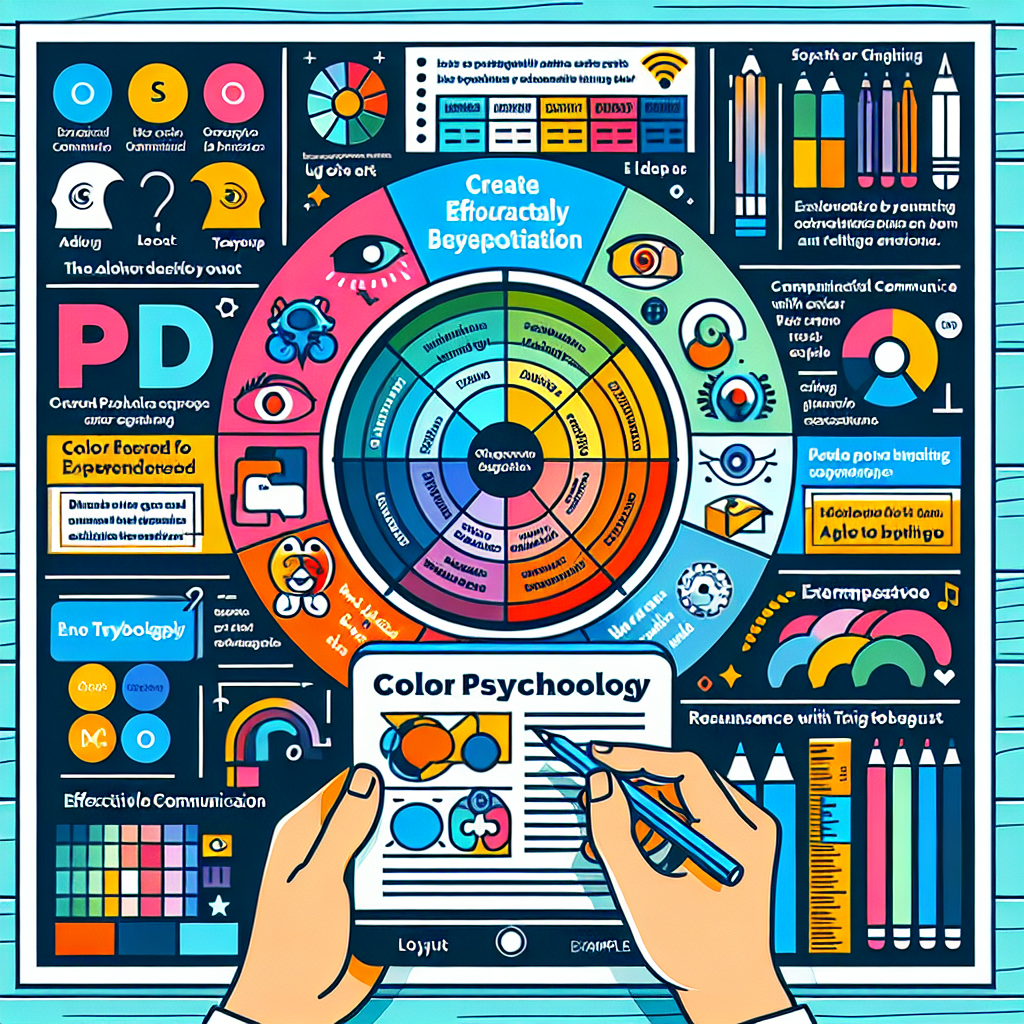
When it comes to designing visually appealing ads, understanding color psychology is crucial. Colors have the power to evoke emotions and convey messages, so it’s important to choose them wisely. Different colors have different psychological effects on people – for example, blue is often associated with trust and dependability, while red can evoke a sense of urgency or passion. By understanding the psychological impact of colors, you can ensure that your ad design resonates with your target audience.
In addition to color psychology, using a limited color palette is also a best practice in ad design. Too many colors can be overwhelming and distract from the intended message. By using a limited number of colors, you can create a more cohesive and visually pleasing design. It’s important to choose colors that complement each other and enhance the overall aesthetic of your ad.
Contrasting colors can be a powerful tool in capturing attention and creating impact. By using colors that are opposite each other on the color wheel, you can create a sense of visual interest and make certain elements of your design stand out. Just be mindful of using contrasting colors in a way that still maintains visual harmony and doesn’t create a jarring effect.
Selecting Suitable Fonts
Fonts play a vital role in ad design, as they contribute to the overall readability and visual appeal of your message. When choosing fonts, it’s important to prioritize readability. Ensure that the font you select is easy to read, even at small sizes. Avoid overly decorative or intricate fonts that may make it difficult for viewers to understand your message quickly.
Mixing font styles can add visual interest and create a dynamic composition. However, it’s essential to use contrasting fonts in a way that maintains balance and harmony in your design. Pairing a decorative font with a simple, clean font can create a visually appealing contrast that enhances the overall aesthetic of your ad.
Optimizing Layout and Composition
Creating a visual hierarchy is an essential aspect of ad design. By establishing a clear hierarchy, you can guide the viewer’s attention and ensure that the most important elements of your ad are given prominence. Consider using size, color, and placement to establish this visual hierarchy. Make sure that the most critical information or the main call-to-action is easily noticeable and stands out from other elements.
Using grids and alignment can help to create a sense of order and structure in your ad design. Grid systems provide a framework that allows for consistency and balance in your layouts. Aligning elements on the grid can help to create a more cohesive and visually pleasing composition. It’s important to maintain a consistent alignment throughout your design to avoid a cluttered or disorganized appearance.
Balancing text and images is also crucial in ad design. Be mindful of the amount of text you include in your ad, as too much text can overwhelm viewers and detract from the overall visual impact. Use images strategically to complement and enhance your message. Images should be relevant to the ad’s content and visually appealing to grab the viewer’s attention.
Including Compelling Images
High-quality photographs can significantly enhance the visual appeal of your ad design. When selecting photographs, choose ones that are well-composed, properly lit, and visually captivating. High-quality images can help to create a positive impression and increase engagement with your ad.
Incorporating illustrations or infographics can also be an effective way to make your ad design more visually appealing. Illustrations can add a unique and creative element to your design, while infographics can present complex information in a visually engaging and easy-to-understand manner. By using illustrations or infographics, you can create a memorable and eye-catching ad design.
Choosing relevant and eye-catching visuals is crucial to capturing the viewer’s attention. Make sure that the visuals you select align with the message and purpose of your ad. Use visuals that are relevant to your target audience and that convey your desired message effectively. The visuals should be visually appealing and able to evoke emotions or attract attention.

Utilizing White Space Effectively
White space, also known as negative space, refers to the empty areas in a design. It is an often overlooked yet powerful element in ad design. Allowing elements to breathe by incorporating white space can enhance the overall aesthetic and readability of your ad. It provides visual relief and ensures that viewers can focus on the important elements of your design.
Enhancing readability and focus can be achieved through effective use of white space. By properly spacing text and other elements, you can improve the legibility of your message and make it easier for viewers to understand. White space can also help to direct the viewer’s attention to specific areas of your ad, such as your call-to-action or main headline.
Creating a clean and minimalist design can be achieved by utilizing white space effectively. By simplifying your design and removing unnecessary elements, you can create a more visually appealing and sophisticated ad. A clean and minimalist design can also convey a sense of professionalism and ensure that your message is communicated clearly and concisely.
Designing Attention-Grabbing Headlines
Headlines are often the first thing viewers notice in an ad, so it’s crucial to design them in a way that grabs attention. Using bold and large fonts can make your headlines stand out and grab the viewer’s attention. Experiment with different font styles and sizes to find the one that best fits your ad’s overall aesthetic and message.
Crafting catchy and concise headlines is essential in capturing the viewer’s interest. Keep your headlines short and to the point, emphasizing the most important aspect of your message. Focus on creating headlines that are unique, intriguing, and compelling to make viewers want to engage further with your ad.
Typography can play a significant role in designing attention-grabbing headlines. Experiment with different typography techniques, such as using different font weights, styles, or even incorporating creative text effects. Typography can add personality to your headlines and make them visually appealing, ensuring that they stand out from the rest of your design.
Applying Consistent Branding
Consistency in branding is crucial to create a cohesive and memorable ad design. Use the brand’s colors and fonts throughout your ad to maintain a consistent visual identity. Consistent use of brand elements helps to reinforce brand recognition and create a sense of familiarity with your audience.
Incorporating the brand’s logo and tagline is important for brand recognition and recall. Make sure that the logo and tagline are featured prominently in your ad and are easily distinguishable. A well-placed and appropriately sized logo can enhance the overall professionalism and credibility of your design.
Maintaining a cohesive look and feel across all your ad designs is essential to establish and reinforce your brand’s identity. Use consistent design elements, such as imagery style or graphic elements, to create a unified visual language. Consistency in branding not only helps to build brand recognition but also creates a sense of trust and reliability with your audience.
Employing Visual Cues
Visual cues can effectively guide the viewer’s attention and draw focus to specific areas of your ad. Using arrows or lines can direct the viewer’s gaze towards important elements or calls-to-action. Arrows can create a sense of movement and draw attention to specific areas of your ad design. Lines, on the other hand, can help to visually connect different elements and create a flow within your design.
Using images that direct the viewer’s gaze is another effective way to employ visual cues. Images that feature characters or people looking towards your intended focal point can subtly guide the viewer’s attention in that direction. By strategically selecting and placing images, you can create a sense of visual movement and lead the viewer towards the desired action.
Incorporating visual elements that convey the desired action is crucial in driving engagement with your ad. For example, using images of people using your product or service can suggest the desired action and create a visual association between your brand and the intended outcome. By employing visual cues that align with your ad’s goals, you can increase the likelihood of viewer engagement and conversions.
Creating Simple and Clear Designs
Cluttered designs can overwhelm viewers and make it difficult for them to understand your message. To create visually appealing ads, it’s important to avoid clutter and ensure that your design is clean and uncluttered. Keep your design simple by focusing on the most important elements and eliminating unnecessary distractions.
Using clear and concise messaging is essential in creating visually appealing ads. Keep your copy short, impactful, and easy to understand at a glance. Use concise language and avoid jargon or complex explanations. By delivering a clear and concise message, you can ensure that viewers quickly grasp the key information and purpose of your ad.
Making the ad easy to understand at a glance is crucial in capturing the viewer’s attention. Use visual elements and design techniques to convey your message quickly and effectively. Visual hierarchy, contrasting colors, and well-structured layouts can make it easier for viewers to understand the main message of your ad at a glance. Simplicity and clarity are key in creating engaging and visually appealing ad designs.
Testing and Analyzing Design Performance
To ensure the effectiveness of your ad designs, it’s important to conduct A/B testing. A/B testing involves creating multiple versions of your ad with slight variations and testing them against each other to determine which design performs better. By testing different elements such as colors, fonts, or layout, you can gather valuable insights and optimize your ad design for better results.
Using analytics to measure ad success is crucial in understanding the impact and performance of your designs. Track metrics such as click-through rates, conversion rates, and engagement to determine the effectiveness of your ad. Analyzing these metrics can help you identify areas for improvement and make data-driven decisions for your future ad designs.
Iterating and improving based on data is a crucial step in creating visually appealing ad designs. Analyze the data gathered from testing and analytics to identify areas for improvement. Make adjustments to your design based on the insights gained and continue to refine your ad designs over time. By adopting a continuous improvement approach, you can create visually appealing ads that resonate with your target audience and drive desired results.


