Creating impactful visual designs for advertising materials can be a powerful way to capture attention and engage your target audience. By leveraging elements such as color, typography, imagery, and layout, you can convey your brand’s message effectively and leave a lasting impression. Whether it’s a logo, banner, or social media post, this article explores the key principles and techniques that can help you create visually stunning designs that demand attention and drive results. So, if you’re looking to make your advertising materials stand out from the crowd, keep reading for some valuable insights and tips.
Understanding the Purpose of Advertising Materials
Advertising materials play a crucial role in conveying messages and promoting products or services to a target audience. Before diving into the design process, it is essential to understand the purpose of these materials. This involves identifying the target audience, determining the desired outcome, and researching competitors’ designs.
Identifying the target audience
One of the key factors in creating impactful visual designs is understanding the target audience. By knowing who you are designing for, you can tailor your designs to their preferences and grab their attention effectively. Consider factors such as demographics, interests, and behavior to create designs that resonate with your audience.
Determining the desired outcome
Each advertising material has a specific goal or desired outcome, whether it’s to increase brand awareness, drive sales, or promote a specific offer. By clearly defining the desired outcome, you can design with purpose and ensure that your visuals align with your goals. Understanding the desired outcome helps guide the design decisions and ensures that you create designs that are aligned with your objectives.
Researching competitors’ designs
To create impactful visual designs, it’s important to be aware of what your competitors are doing in the market. Take the time to research their advertising materials and analyze what works well and what can be improved upon. This research not only helps you gain insights into the industry trends but also allows you to differentiate your designs and create something unique and compelling.
Choosing the Right Design Elements
Once you have a solid understanding of the purpose of your advertising materials, it’s time to choose the right design elements that will help you achieve your goals. Consider elements such as color psychology and branding, typography selection, and visual hierarchy.
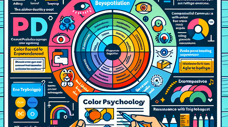
Color psychology and branding
Color plays a crucial role in influencing emotions and perceptions. It’s important to choose colors that align with your brand identity and evoke the desired emotions in your audience. Research color psychology and consider the effect each color has on the viewer. Use your brand colors strategically to create a cohesive and recognizable visual identity.
Typography selection
Typography is an essential design element that can convey a message, set a tone, and enhance the overall visual appeal. Choose fonts that are legible and align with your brand’s personality. Experiment with different font combinations to create hierarchy and emphasis within your designs. Remember to consider readability across different platforms and sizes.
Visual hierarchy
Visual hierarchy refers to the arrangement and prioritization of elements in a design. By using size, placement, and contrast, you can guide the viewer’s attention and highlight important information. Think about what you want your audience to notice first and design your layout accordingly. Create a clear and organized visual hierarchy, ensuring that the most important information stands out.

Creating Compelling Layouts
The layout of your advertising materials can greatly impact their effectiveness. By considering factors such as utilizing whitespace effectively, balancing text and images, and using grids and alignment, you can create layouts that are visually appealing and engaging.
Utilizing whitespace effectively
Whitespace, also known as negative space, is the empty area between and around elements in a design. Utilizing whitespace effectively helps create a clean and uncluttered layout, allowing the content to breathe. It also enhances readability and helps the viewer focus on the key elements of your design. Don’t be afraid to leave empty spaces and avoid overcrowding your design with unnecessary elements.
Balancing text and images
Finding the right balance between text and images is crucial in creating engaging advertising materials. The visual elements should complement and enhance the text, rather than overshadowing it. Ensure that the text is legible and properly aligned with the images. Experiment with different placements and proportions to achieve a harmonious balance.
Using grids and alignment
Grids and alignment are powerful tools in creating visually pleasing designs. They provide structure and consistency to your layout, making it easier for the viewer to navigate and comprehend. Consider using a grid system to align and organize your elements. Align text, images, and other design elements to create a unified and professional look.
Utilizing Attention-Grabbing Visuals
Compelling visuals are key in capturing the attention of your audience. By utilizing high-quality and relevant images, incorporating illustrations and icons, and creating infographics and data visualization, you can create advertising materials that stand out.
High-quality and relevant images
The use of high-quality and relevant images can significantly enhance the impact of your advertising materials. Avoid generic stock photos and invest in professional photography or high-resolution images that align with your brand and message. Ensure that the images are clear, visually appealing, and evoke the desired emotion or reaction from your audience.
Illustrations and icons
Illustrations and icons can add a unique visual appeal to your advertising materials while conveying information effectively. Consider using custom illustrations that reflect your brand identity and resonate with your target audience. Icons can be used to represent concepts or features, creating visual interest and aiding in communication.
Infographics and data visualization
Infographics and data visualization are excellent tools for presenting complex information in a visually appealing and digestible manner. They can help simplify data and statistics, making them more engaging and easy to understand. Utilize charts, graphs, and other visual elements to present information in a way that captures attention and enhances comprehension.

Making Use of Visual Contrast
Visual contrast is a powerful technique that can help emphasize specific elements and create visual interest in your designs. By contrasting colors, varying sizes and shapes, and playing with light and shadows, you can make your advertising materials visually striking.
Contrasting colors
Contrasting colors create visual impact and draw attention to specific elements. Choose colors that are opposite on the color wheel to create maximum contrast. For example, pairing a vibrant orange with a deep blue can create a strong visual contrast. Use contrasting colors strategically to highlight important information or create visual focal points within your designs.
Varying sizes and shapes
Varying the sizes and shapes of your design elements can also create contrast and visual interest. Experiment with different proportions and scales to emphasize the hierarchy and importance of certain elements. By juxtaposing large and small elements or combining different shapes, you can create eye-catching designs that capture attention.
Playing with light and shadows
Light and shadows can add depth and dimension to your advertising materials. By applying shadows and highlights, you can create a sense of realism and make elements stand out. Use subtle gradients or drop shadows to create depth and separate elements from the background. Carefully consider the direction and intensity of the light source to achieve a natural and appealing effect.
Enhancing Designs with Visual Hierarchy
Visual hierarchy is crucial in guiding the viewer’s attention and highlighting the most important elements in your advertising materials. By creating focal points, using size and placement, and applying contrasting elements, you can enhance the visual hierarchy and ensure that your message gets across effectively.
Creating focal points
Focal points are the areas of your design that draw the most attention. By consciously designing elements to stand out, you can guide the viewer’s focus to the key message or call-to-action. Use color, size, contrast, or placement to create focal points, ensuring that they align with your design goals.
Using size and placement
Size and placement are essential tools for establishing visual hierarchy. Larger elements tend to grab more attention than smaller ones, so use size strategically to emphasize important information. Place key elements in prominent positions, such as the center or the top of the design, to ensure that they are noticed first.
Applying contrasting elements
Contrasting elements, such as color, texture, or typography, can help create visual interest and draw attention to specific areas. Use contrasting elements to differentiate important information from secondary details. For example, using a bold font for headlines and a lighter font for body text creates a clear distinction and guides the reader’s attention accordingly.

Utilizing Effective Call-to-Actions
Call-to-actions (CTAs) are crucial in encouraging the desired response from your audience. By utilizing clear and concise language, highlighting the desired action, and optimizing their placement and visibility, you can make your CTAs more effective and compelling.
Using clear and concise language
Your call-to-action should clearly state what action you want your audience to take. Use concise and straightforward language that leaves no room for confusion or ambiguity. Consider using action verbs that prompt immediate action and create a sense of urgency. Keep your CTAs short and to the point.
Highlighting the desired action
Make your call-to-action visually stand out from the rest of the design to draw attention. Use contrasting colors, different typography, or surrounding whitespace to make the CTA visually distinct. Ensure that it is easily recognizable as a clickable or interactive element, encouraging users to take the desired action.
Placement and visibility
The placement and visibility of your call-to-action can greatly impact its effectiveness. Ensure that it is strategically placed where it can be easily seen and accessed. Consider placing it above the fold or at the end of a section where the user’s attention is focused. Don’t overcrowd your design, but make sure the CTA is prominent enough to catch the viewer’s eye.
Maintaining Consistency and Branding
Consistency and branding are essential in creating a cohesive and recognizable visual identity. By using brand colors and fonts, maintaining a consistent visual style, and adapting your designs to different platforms, you can strengthen your brand presence and create a unified experience.
Using brand colors and fonts
Consistency in color and typography is crucial in reinforcing brand recognition. Use your brand colors consistently throughout your advertising materials to create a strong visual identity. Choose fonts that align with your brand guidelines and use them consistently across different platforms. Consistency in color and typography helps create a cohesive and professional look that resonates with your audience.
Consistent visual style
In addition to colors and fonts, maintaining a consistent visual style is important in creating a recognizable brand identity. Define a set of design elements, such as shapes, patterns, or graphic elements, and use them consistently across your advertising materials. Consistency in visual style creates a unified and cohesive look, helping your brand stand out.
Adapting to different platforms
In today’s digital age, it’s crucial to adapt your designs to various platforms and devices. Consider how your advertising materials will be viewed on different screen sizes and orientations. Optimize your designs for mobile devices and ensure that they are responsive and visually appealing across different platforms. Adapting your designs to different platforms helps you reach a wider audience and maintain consistency in your brand presence.
Testing and Iterating Designs
To create impactful visual designs, it’s important to test and iterate your designs based on feedback and data. By gathering feedback, conducting A/B testing variations, and refining your designs based on data, you can continuously improve and deliver advertising materials that resonate with your audience.
Gathering feedback
Feedback from your target audience, colleagues, or professionals in the field can provide valuable insights and help you identify areas for improvement. Share your designs and ask for constructive criticism. Pay attention to both positive feedback and areas that need improvement, and use it as a basis for refining your designs.
A/B testing variations
A/B testing involves creating multiple variations of your designs and testing them against each other to determine which one performs better. This allows you to make data-driven decisions and refine your designs based on audience preferences. Test different design elements, such as color schemes, layouts, or CTAs, and measure the response to choose the most effective variation.
Refining based on data
Data analysis is a powerful tool in improving the effectiveness of your advertising materials. Analyze the performance metrics of your designs, such as conversion rates, click-through rates, or engagement levels. Identify patterns and trends to understand what elements are working and what needs improvement. Refine your designs based on the data, making iterative changes to optimize their impact.
Conclusion
Creating impactful visual designs for advertising materials is a multi-step process that requires understanding the purpose, choosing the right design elements, creating compelling layouts, utilizing attention-grabbing visuals, making use of visual contrast, enhancing designs with visual hierarchy, utilizing effective call-to-actions, maintaining consistency and branding, and testing and iterating designs. By applying design principles, experimenting, and continuously learning from feedback and data, you can deliver advertising materials that make a lasting impact on your target audience. Remember to always prioritize the needs and preferences of your target audience, ensuring that your designs effectively communicate your message and achieve your desired outcomes.